Employer
Design Team
- UI/UX Designer (me)
- Senior Web Developer
- Team Manager
- IT Department Director
What I did
- User Interviews
- Interaction Design
- HTML, CSS, JavaScript
What I used
- Pen and paper
- Atom (Code Editor)
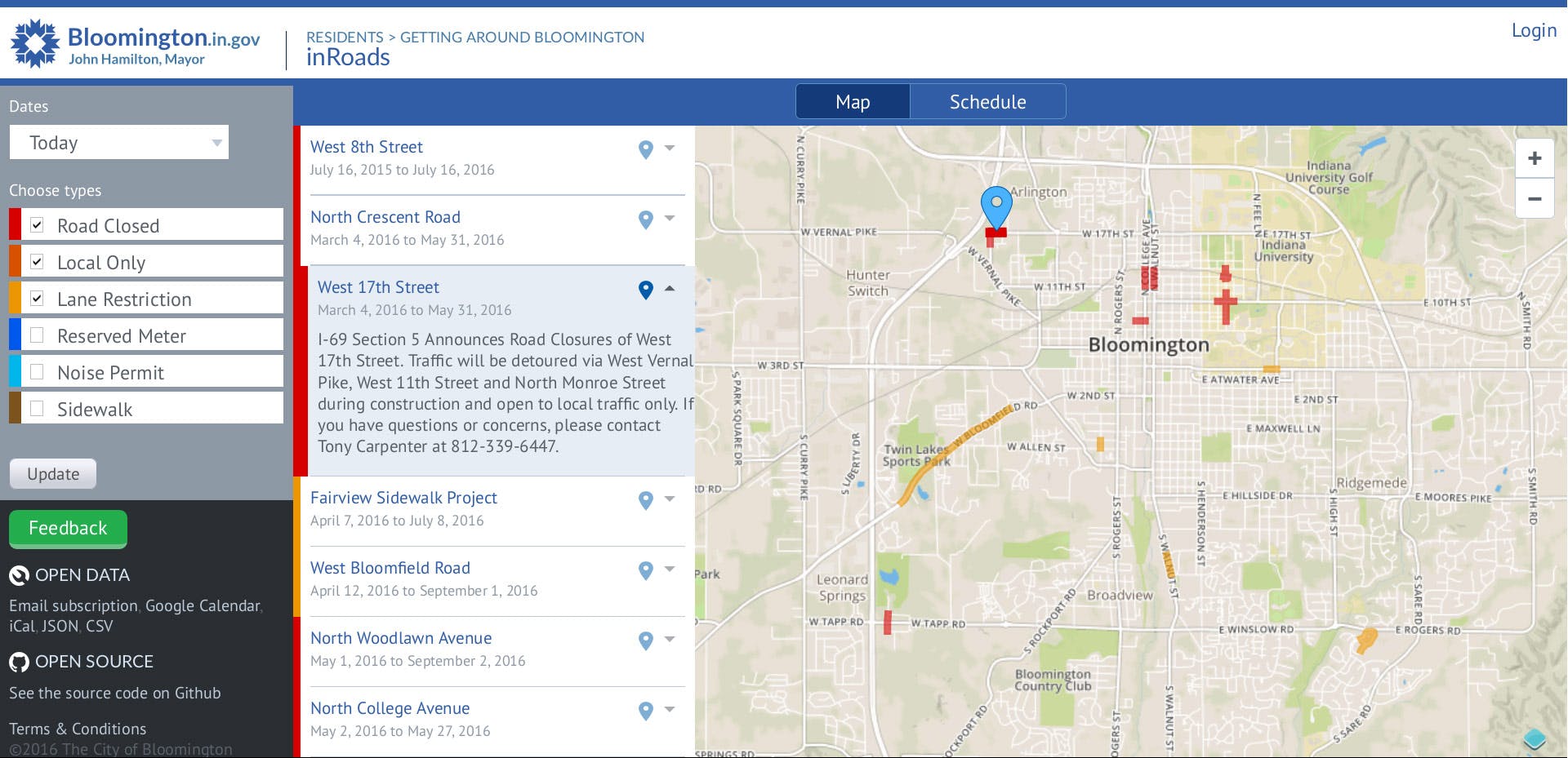
Drivers need to know when and where roads will close
If you wanted to know when and where roads will close in Bloomington, IN, you needed to subscribe to an email list, or to the local newspaper.
The year was 2015. My team at City Hall was tasked with building an app that would show where roads will close—in ways drivers can more easily understand.
Data entry duties landed on one person
For this story, we’ll call our admin user Jean. The developer and I met Jean at her office, where she walked us through her process.
Jean received emails about road closures throughout the week. Every Friday, she copied and pasted bits and pieces of each email, tediously re-formatting each new piece, until she had a pristine, polished email—ready to send. It was always a race to beat the 3 o'clock deadline.
Manually formatting text clearly made this process time consuming. We saw an opportunity to solve this pain point.
How we kept the admin UI lean
Because only one person would initially use this, we were required to deliver it with the lowest level of effort possible.
The front end of inRoads. We had already invested significant effort in the front end of the application, so to keep design and development lean on the back end, we repurposed design patterns and code from the front end.
Using the front end as a starting point, our goal was to eliminate the manual formatting overhead in Jean’s process. We would build:
- …a web form that captured the information necessary to convey where, when, and why a road closure was scheduled to occur.
- …a drawing tool to trace the shape of the closure on a map.
- …a script that would compose the weekly road closures email and send it to the mailing list every Friday at 3:00 PM.
Starting with a form and a simple drawing tool
To implement the drawing interaction, the developer chose the OpenLayers library, built a working prototype, and followed up with me for UI and IxD input.
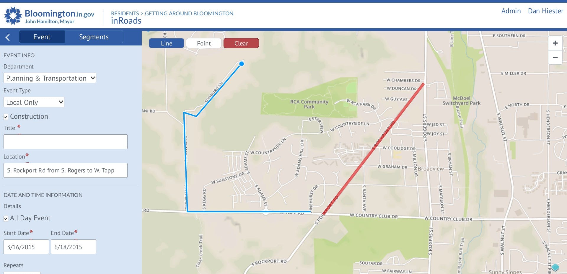
The back end of inRoads, designed and implemented mostly from components repurposed from the front end. The developer and I worked in tandem to design the form, with most of our time and attention going into the date and time portion of the form.
Catching our mistake and fixing it
With the prototype running live in browser, we were able to do everything we needed—but we kept saying, “Oops. I clicked wrongly again.”
The UI started up in drawing mode, but internal UI testing showed us users need to position the map first, before they start drawing. I solved this problem by having the UI start in map dragging mode, so the user would choose when they enter drawing mode.
UI Remix
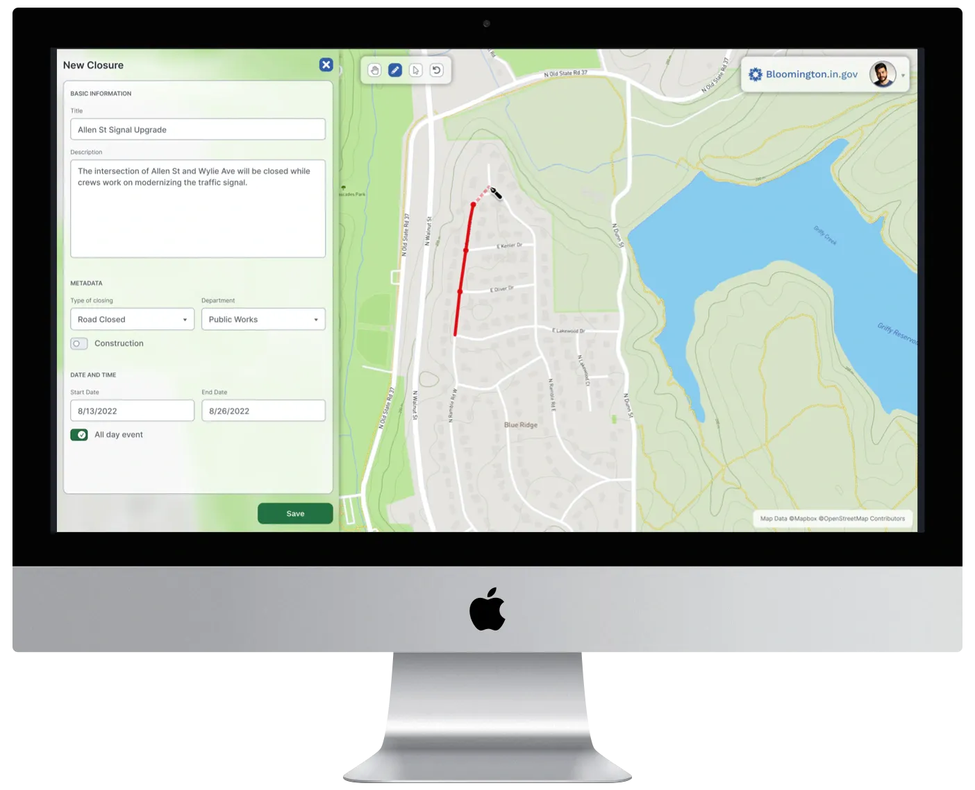
In 2022, I remixed the UI of this project using Figma, to show how my knowledge of UI craft has evolved in recent years.

How I might design the index screen differently in 2022. I’ve added a search bar that wasn’t in the original design. An admin looking to make edits is more likely to know which words to search for than a driver planning their travel. I’m also fixing my mistake of using color alone to indicate the type of road closure, by adding icons for different types.

How I might design the create and edit screen differently in 2022. I’m using familiar icons for the user to select which mode they need for the drawing tool, and increasing the width of the data entry form to reduce the need for scrolling.
Our app enabled a game-changing productivity trick
Thanks to our app, Jean was able to work with each piece of road closure information as soon as it arrived in her email, instead of letting it pile up all week.
Even though drawing the road closing on the map increased the overall amount of information Jean entered, the web form made her work so much more efficient than manually re-formatting text in an email window, she achieved more output in dramatically less time.
Jean’s Fridays were no longer a constant, stressful, weekly race against time. Fridays went back to being Fridays.
She told us that she joked with her coworkers: “If you have a really big problem, just have the IT guys make an app for you. It’s that easy!”
What I learned
Let users choose their activity—don’t choose for them. We were excited to add drawing functionality to our web app—so excited, we assumed it made sense to start drawing right away. But in testing, we found it was critical to let the user make the decision about when they are ready to begin drawing.
Meeting our user and watching her work made a big difference. Seeing her process gave me a natural, intuitive understanding of the problem. Talking with her revealed personal details about how her old workflow led to problems at the office—and outside the office. I couldn’t have known about that if a supervisor had written me a design brief. The time investment was small, but the return on that investment was huge.